


Tagline - Feel it
Founder
Rick Alden
Founder’s Vision
Skullcandy came screaming into this world as the brainchild of notorious non-conformer and action sports product mastermind Rick Alden. One day as he was hauling to the top of a Park City peak for another powder run, he had to yank out his ear buds from his music player and use them to answer his phone. That's when a simple but powerful idea hit him. What if there were headphones that could seamlessly switch from music to calls? And what if those headphones actually looked as good as they worked? That idea, on that chairlift, on that day, was the bedrock Skullcandy was built on.
Target Market
Urban youth with disposable income and more concerned for fashion and brand recognition. People who value freedom.
Strengths
High price sensitivity
No switching cost
Multiple alternatives
Great warranty
Good branding
Weakness
Highly competitive industry
High budget marketing
Low cost alternatives
Time to market
Lack of segmentation
Their Mission
Unleash the visceral power of music for all.
Their Vision
Be the #1 brand for the youthful and adventurous audio consumer.
Their Values
Skullcandy wasn’t founded in some corporate office. Even our name defies convention. To stay true to our core, we can’t settle for easy or obvious. Everything we do should challenge the status quo.

Keyword

design variations

creative process
EARPHONES
INNITIALS
's' and 'c'
audio
skull

brand attributes
EARPHONES TO SHOW
BRAND IDENTITY OF THE
COMPANY
WIRELESS EARPHONES
TO SHOW INNOVATION
AND ADAPTATION TO
MODERN TECHNOLOGY
SHARP EDGES TO
ATTRACT COOL AND
ENERGETIC AUDIENCE
AUDIO SYMBOL TO
SHOW THAT COMPANY
CREATES AUDIO
PRODUCTS

LOGO TYPEFACES
Brand Typeface
Impact
Aa
Aa Bb Cc Dd
0123456789
About
Impact is a sans-serif typeface in the industrial or grotesque style designed by Geoffrey Lee in 1965 and released by the Stephenson Blake foundry or Sheffield. It is well known for having been included in the core fonts for the Web package and distributed with Microsoft Windows since Windows 98.
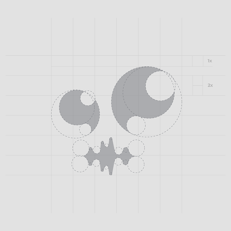
Symbol construction


COLOUR PALETTE
neutral
THIS COLOUR IS USED TO BALANCE OVERALL COLOURS and to provide minimalist appeal to the logo
Dark
Each Primary colour is accompanied by two shades to give versatility in applications

BOLD
Primary color that depicts passion, excitement, energy and courage that represents business
COmplimentary
This color is used to compliment bold one and to show responsibility, security and trust

R : 254
G : 49
b : 90
FE315A
C : 0%
M : 99%
Y : 51%
K : 0%

R : 22
G : 116
b : 152
167498
C : 95%
M : 43%
Y : 25%
K : 3%

R : 120
G : 119
b : 135
787787
C : 56%
M : 50%
Y : 34%
K : 6%

R : 34
G : 61
b : 82
223d52
C : 93%
M : 70%
Y : 45%
K : 36%
Logo lEgibiliTy


comparison
Current


Concept
CONCEPT
Minimalist
Modern
Energetic
sharp
keeps the idea
responsibility
movement
application icons

110px


80px


40px


Mockup


BRAND GUIDELINES
Logo clear space and computation


This logo should never be changed. Position, text along with the spatial proportion of skullcandy logo elements are predetermined and should never be changed.
Typography
Impact
Bebas neue
The primary font of the brand is Impact can be used on any branded item and logo. The secondary font is Bebas Neue can only be used for headlines and for emphasis.
Colors

R : 254
G : 49
b : 90
FE315A
C : 0%
M : 99%
Y : 51%
K : 0%

R : 22
G : 116
b : 152
167498
C : 95%
M : 43%
Y : 25%
K : 3%

R : 120
G : 119
b : 135
787787
C : 56%
M : 50%
Y : 34%
K : 6%

R : 34
G : 61
b : 82
223d52
C : 93%
M : 70%
Y : 45%
K : 36%
Colour palette
Use these colors for any printed or digital pieces. This palette has been selected to best tell the story of the brand. Lighter tints of these colors are allowed but logo must always be kept at 100% tint.
Images


Image effects
To add emphasis and effect to image you can add the gradient map to the image, use images with this effects for promotion or website.

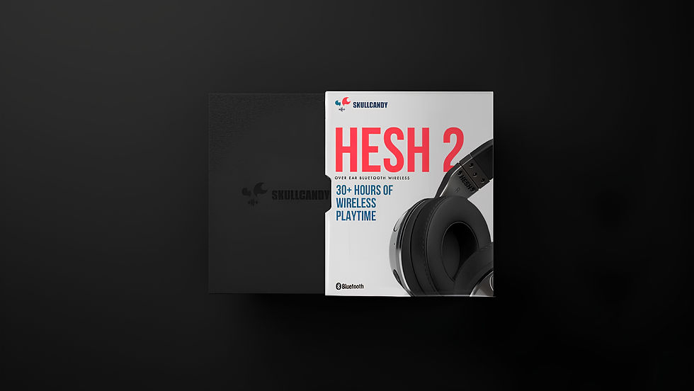
Package measurements


Wireframe

Webpage design


